Atomic Components
Atomic components in our design system establish the visual attributes of individual graphic elements, such as size, color, and shape. They play a crucial role in shaping the overall style and consistency of the app.
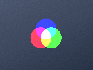
Color atom
Defines the appearance of app components by applying color properties.
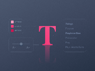
Font atom
This atom sets font properties across devices, including color, family, and size.
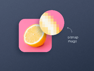
Image atom
Exclusive to bitmap images, the image atom plays a central role in app design.
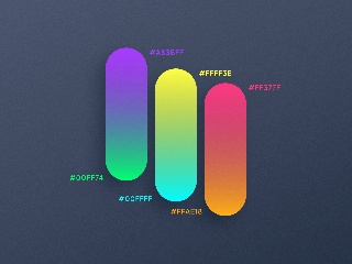
Gradient atom
This constitutional object of the background component produces a gradient.

Shape atom
The Shape Atom presets component shapes for a consistent design.

Shadow atom
Managing component shadows with preset levels and customization options.

Size atom
The size atom describes the size of a component.

Border atom
This atom defines outline properties like their color and their size.

Blur atom
Applies blurring effects to a component to create a sense of depth and focus.
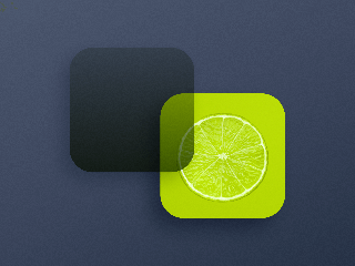
Overlay atom
A customizable gradient can be placed atop images, components, or pages.
 Design