iOS Component
The Date & Time picker component in the GoodBarber Design system for iOS devices follows the Human Interface Guidelines of iOS to ensure a familiar and consistent feel for your users. It is designed to be simple and elegant, providing users with a smooth and seamless experience for selecting a date and time.

https://developer.apple.com/design/human-interface-guidelines/ios/controls/pickers/#date-pickers
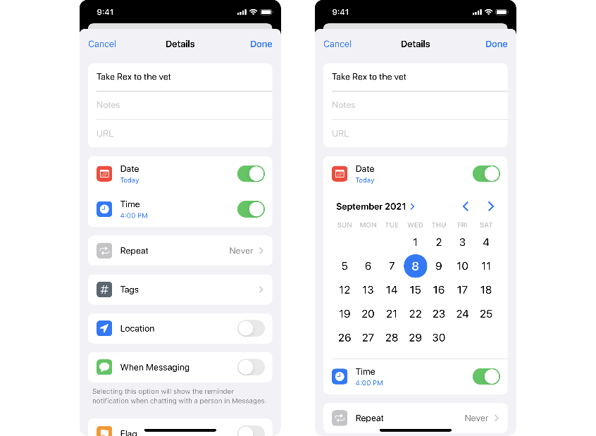
Pickers — Compact
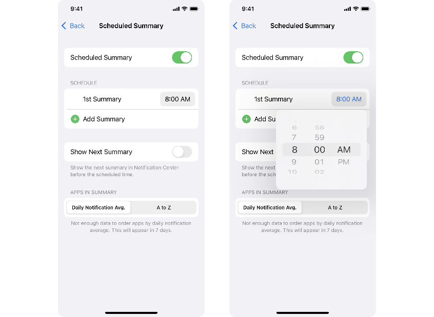
Pickers — Inline
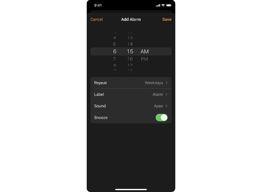
Pickers — Wheels
https://developer.apple.com/documentation/uikit/uidatepicker
Android Component
Material Design > Guidelines > Date / Year Pickers
https://material.io/archive/guidelines/components/pickers.html#pickers-date-pickers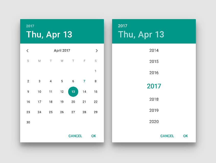
https://material.io/archive/guidelines/components/pickers.html#pickers-time-pickers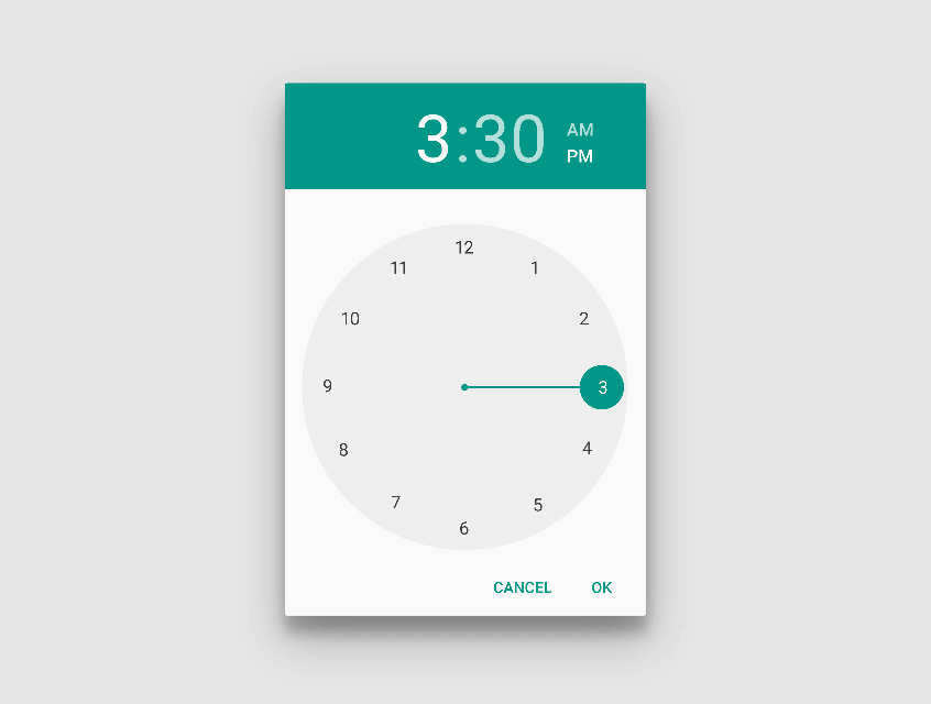
Material Design > Components > Date / Year Pickers
https://material.io/components/date-pickers#mobile-pickers
https://material.io/components/date-pickers#desktop-pickers
Material Design > Components > Time Pickers
https://material.io/components/time-pickers
Developer > Android > Guide > Controls pickers
https://developer.android.com/guide/topics/ui/controls/pickers
PWA Component
Anatomy
The structure of the pickers are the same on all devices, only the font size changes.
Features:
- Opens the year picker
- Switching from one month to the next
- Highlighting of today's date
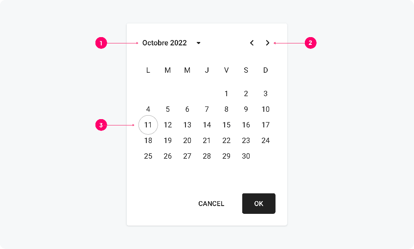
Calendar structure
These structures are used for all devices. The green areas represent dynamic areas, where the length of the word can vary.
Please refer to the component inspector at the bottom of the page to examine the component in detail.
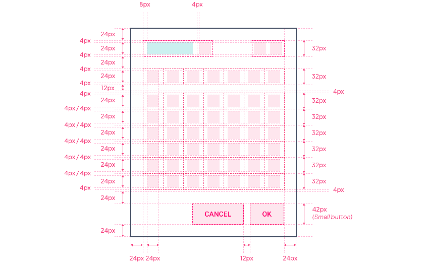
Text blocks, icons and buttons
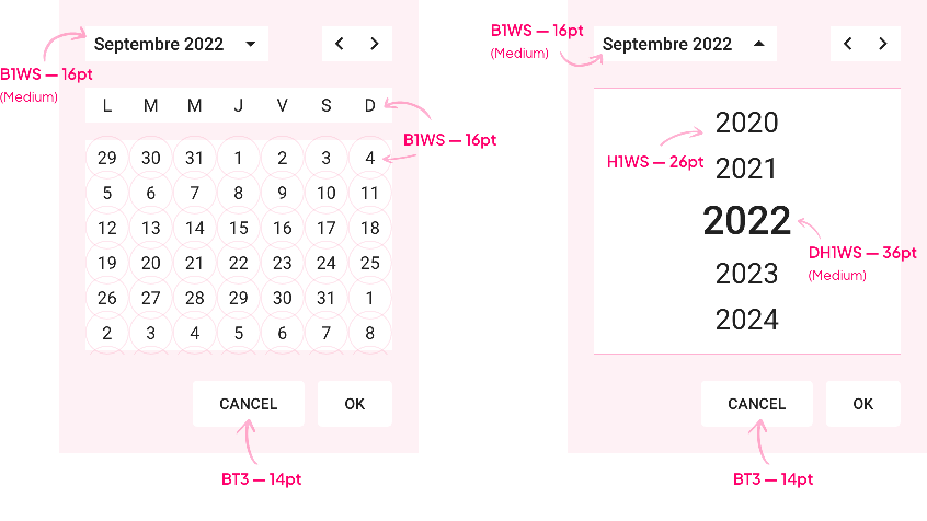
The illustration below shows the size of the elements and their spacing.
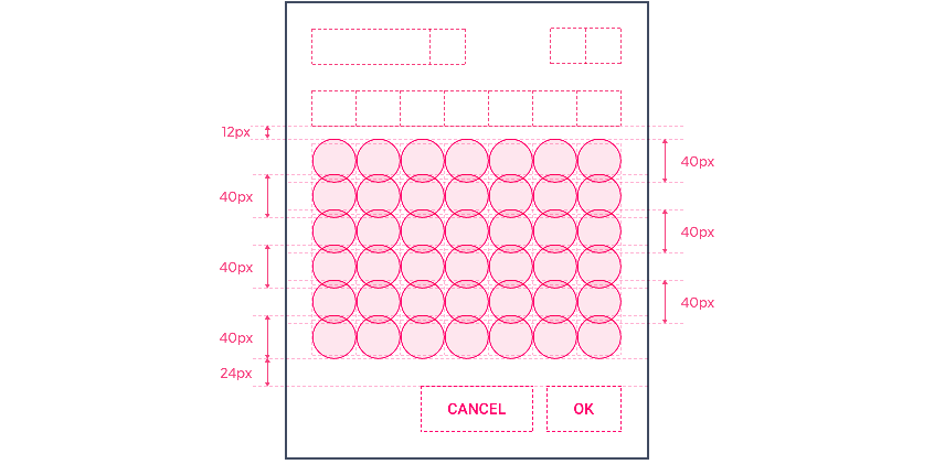
Highlighting of dates
Size of highlights and placement.
Year picker structure
The green areas represent dynamic areas, where the length of the word can vary.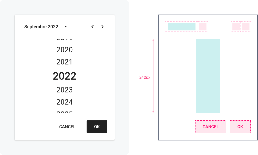
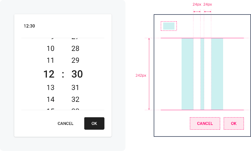
Time picker structure
The green areas represent dynamic areas, where the length of the word can vary.
Font Size
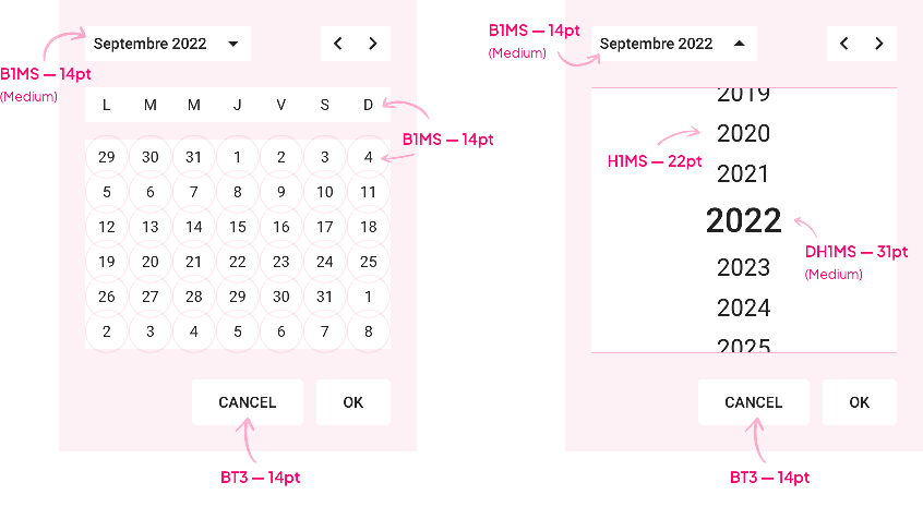
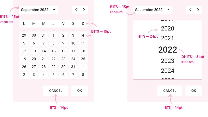
The font size changes according to the devices, but not according to the user's choice.
Sizes are : DH1 Small / H1 Small / B1 Small. In the examples below, the font used is Roboto. The size for the hours is the same as the one used here for the years.
| Text level | Device | Size | Font size | Web | ||||||
|---|---|---|---|---|---|---|---|---|---|---|
| Display Heading 1 | Mobile | Small | 31 | DH1MS | ||||||
| Tablet | Small | 34 | DH1TS | |||||||
| Web | Small | 36 | DH1WS | |||||||
| Heading 1 | Mobile | Small | 22 | H1MS | ||||||
| Tablet | Small | 24 | H1TS | |||||||
| Web | Small | 26 | H1WS | |||||||
| Body 1 | Mobile | Small | 14 | B1MS | ||||||
| Tablet | Small | 16 | B1TS | |||||||
| Web | Small | 16 | B1WS |
Mobile
Tablet
Web
Properties
Shape
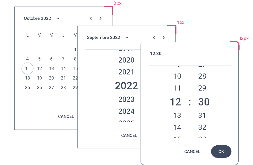
The Shape atom applied to pickers with the types Sharp / Rounded / Round:
Border
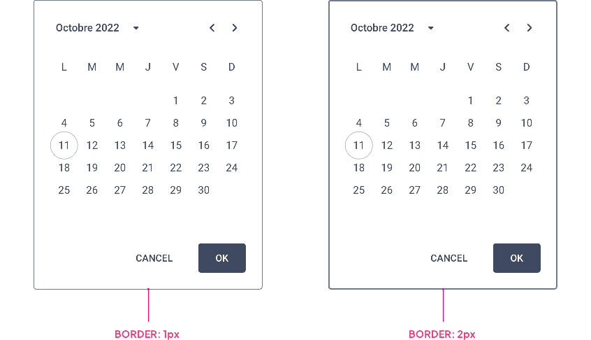
If the Border Atom is applied, its value changes depending on the state of the component. The calendar becomes active as soon as you click on it:
| Inactive State | Focus State |
|---|---|
| ↓ | ↓ |
Shadow
Mobile
The Calendar component is displayed as a Modal on Mobiles, it then inherits by default the Shadow atom, type Level 4.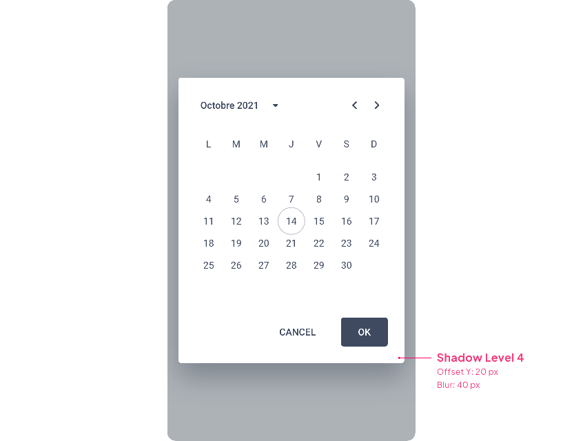
Tablet & Web
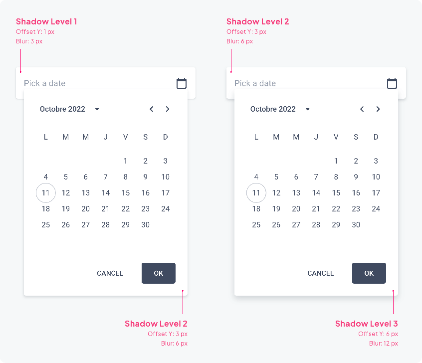
Below are two examples of combinations of shadow levels to accentuate the elevation effect more or less.
 Design