 eCommerce
 Systèmes d'abonnement
 Chatbot
 Cours en ligne
 Réservation en ligne
 Guide touristique
 Evènements
 Créateurs de contenu
 Click & Collect
 Journaux
 Radio
 Ecoles et Universités
 Spiritualité
 Associations
 Restaurant
 Epicerie
 Créez votre app sur-mesure
 Communication d'entreprise


 APP BUILDER NO CODE
 TECHNOLOGIE
 POURQUOI GOODBARBER ?
 Design
 RESSOURCES LIEES AU PRODUIT
 THEMATIQUES

 REVENDEURS D'APPS
 À DÉCOUVRIR


UI Elements
UI elements are the building blocks of our components. Each element combines atoms of the design system to do a single job. Assembled together, elements form the components of the app.
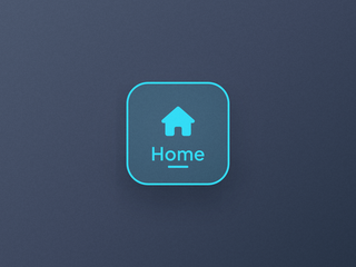
Item
The structural unit of a navigation entry, with its child elements.
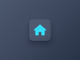
Item Icon
The pictogram of a navigation entry, on its own background layer.
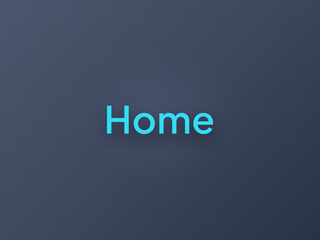
Item Label
The text of a navigation entry, in three sizes that adapt to each device.

Item Indicator
The marker of the selected entry of a navigation.
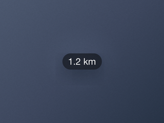
Distance
The label that shows how far a place is.
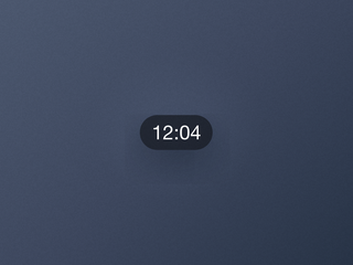
Duration
The label that shows how long a video lasts.

Pager
The dots that show where you are in a carousel.

Play
The icon that signals playable media.
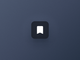
Action
The contextual button to act on a piece of content.
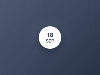
DateBullet
The date of an event, at a glance.
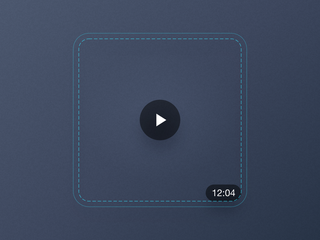
Media
The container that anchors elements over a cell's image.
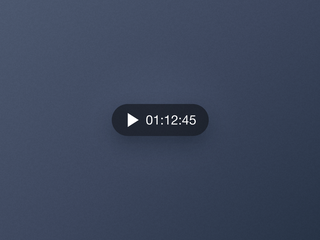
Player
The control that plays and pauses audio, right from its cell.
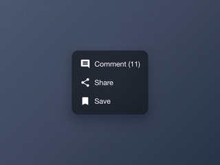
Actions Menu
One icon that opens every action available on a piece of content.
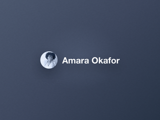
Author
The avatar and the name that credit the creator of a piece of content.
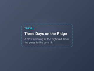
Content
The stack of text blocks that describes a piece of content in a cell.
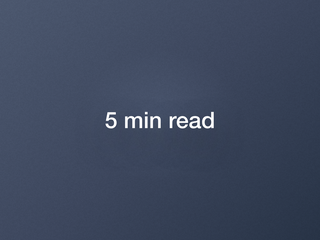
Text
A basic element, a piece of text styled by its context.
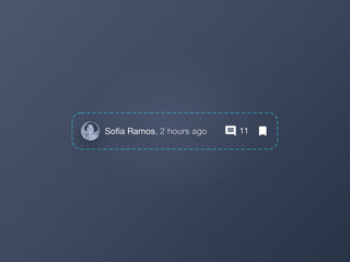
ToolBar
The row that lines up the metadata and the actions of a cell.
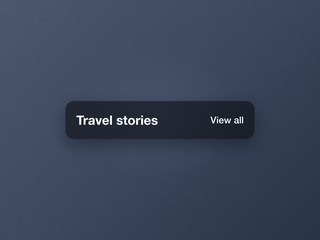
Widget Header
The title bar of a home widget, and its link to the section.

Address
The location icon and the full address of a geolocated piece of content.
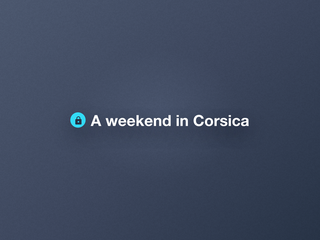
Premium Sticker
The sticker that marks the content reserved for subscribers.

Story Pager
The segments that show the progress of a story slideshow.
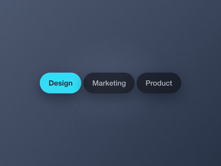
Filter Bar
The categories above a list, as Tags, Labels, Filters or a Dropdown.
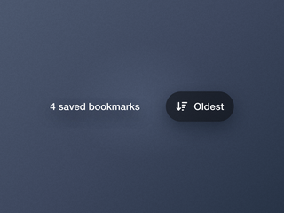
Sorting Bar
The item count and the sort button above the favorites list.
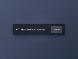
Toast Feedback
The short message that confirms a removal and offers to undo it.


